
Last week I mentioned that I’ve been working on painting the fireplace Behr’s Bermudan Blue and gave you a sneak peak at the other blue wall in the making in our kitchen. The plan was to paint one accent wall in a deep navy. I brought home a fistful of paint samples back from the Home Depot and, after a few weeks of deliberation, picked Behr’s Deep Royal. On the swatch it appeared not too black, not too purple and very dark. Well, turns out I should have shelled out the $2.39 for the little tester pot of it because what you see on the swatch is not necessarily what it will look like on the wall.
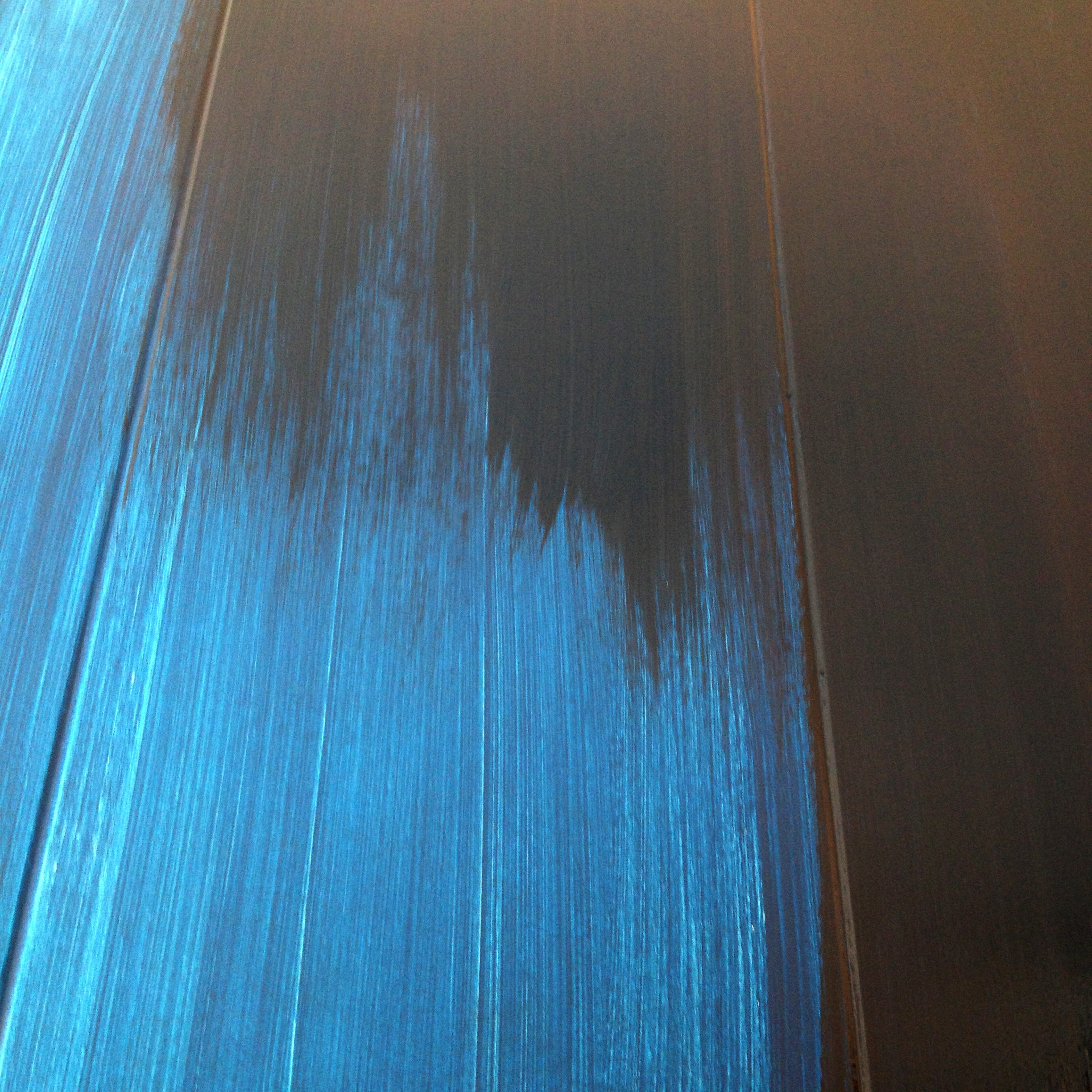
Need proof? Brace yourselves…once I got the first coat on it was looking like this:

Scary right?
I kept telling people that it would get darker with each of the 2-3 more coats that it needed, but really I think I was trying to convince myself.
It wasn’t working.
I was beginning to think I had made a huge mistake. Every time I walked into the room my heart would start beating a little faster and I’d start to sweat. After one near sleepless night (over paint, I know, I’m ridiculous) I decided that I wasn’t going to waste my time painting additional coats of the same heart-stopping color. I needed help.
I took my gallon of paint back to Home Depot and looked again at their paint decks. This time I picked up Berh’s Midnight Dream. I didn’t want to waste the paint I already had (and had already paid for) so I took it up to the desk and asked them to try and re-tint my gallon to as close to Midnight Dream as possible. The darker the better, I told them.
What they turned out was perfect. It’s actually about 10% darker than Midnight Dream (the mixologist — did I just make that up? — told me that her first go turned out to be nearly an exact match once it dried, but that she’d already added more black to the can by that time). Fine by me! At least wasn’t blazing blue anymore.
In fact, it was perfect.

As soon as I brushed that first stroke of re-tinted paint onto the wall my qualms dissipated. That was the color I was after.

Can you hear my sigh of relief? Below from left to right: the re-tinted Midnight Dream, Deep Royal, and the original walnut cabinetry that we love.

Another progress shot. It’s no longer the same colors as my little’s patriot blue Crocs! Midnight Dream for the win! Below you can see that the darker paint has been applied along the top of the wall above the windows and the brighter blue is still on the bottom and that vertical end piece.

Side note: those frosted windows look into our laundry room. I don’t really mind them — they’re actually a really neat rippled glass with a slight aqua tint — but I do wish you couldn’t see the backs of our washer and dryer (or all the crap that tends to pile on top of them). I think laundry units were shorter 60 years ago. I wonder how it would look if I added something with an adhesive backing on the laundry room side to make them less transparent?? I could go with a standard white, or even a fun retro pattern if it could carry its own through the ripples in the glass (unlikely — I think it would get distorted).
But back to the paint, if it’s not already obvious, let me tell you: I am in LOVE with this color. I mean, I find myself walking into the kitchen just to stare at it.

I need to relocate our coffer maker…
It still needs one more coat to get full coverage, but this is as dark as it’s going to get. I think this shade really complements the cabinetry nicely and once we get some new flooring in here (soon!) the whole room will really come together. I have plans for those new chairs to, but I’ll tell you about that another time…
Some of you may remember that we were toying with the idea of painting that front wall of windows navy as well, but ultimately we decided against it. While I think it would really draw attention to all those windows above the counter by framing them in such a high contrast color, we would have to carry the paint down the wall behind the dining table. Having that much dark paint (two full walls) in such a small space seems really confining. Also, we really like the way those windows disappear when the sun is shining through them and that’s pretty much the design intent with this style of house anyway — blending the inside with the outside.
So, we’ve decided to stay true to that — one accent wall is enough and we’ll be painting the front wall a super pale shade of gray.
Here are a few shots from the past 7 months so you can see where were started. This was taken during our initial walk-through prior to closing.

We finally got rid of the wallpaper and the fuzzy yellow backing about 3 months in. We ditched the rusted mini-blinds a couple months after that and primed the walls right around then, too.

And here we are today.
We still need to paint the other three walls, recoat the countertops, and address the floor. Slowly, but surely!

March 21, 2014 at 9:56 am
Nice work, Olivia! I agree that the backs of the washer/dryer are a problem. Maybe you can find some material that is as long as the “window” and high enough to block view of backs of appliances. Then wedge it in from the back to conceal the uglies. What about a piece of plywood, painted your new color. Or maybe a leftover piece of stone from a stoneyard. You could try backpainting the glass (it’s glass, right?). Or to test drive the idea, try it with foam poster board, and see what it looks like (you could even paint it to test that. White might work, too.
Not exactly authentic, mid century, but hey, neither are todays washer/dryers. And I think the front loaders are higher.
God luck, and keep us informed.
March 21, 2014 at 1:05 pm
Thank you! What great ideas! I actually purchased a roll of frosted contact paper for windows the other day. I’m not sure if it will be opaque enough to hide the washer and dryer, but I’m willing to test it out! I’ve also thought of painting the backs as you suggested, but I have two fears: 1) that it will inhibit light from entering the laundry room (it’s a fairly large room with only one window for natural light–probably why these sliding windows exist to begin with); and 2) back painting might look great from the kitchen, but could look pretty crummy from inside the laundry room. BUT, that said, both contact paper and paint are completely removable so we shall see!
March 21, 2014 at 2:22 pm
Love the navy! Could you maybe do contact paper on the front/kitchen side of the window? I think a metallic might look amazing with the navy. Oh wait…guess that would inhibit the natural light. Tough decision!
March 21, 2014 at 2:25 pm
I love the idea of a metallic paper — I hadn’t thought of that! But you’re right. I think most anything I put up with block nearly all natural light. I’ll have to decide between the lesser of two evils!
Pingback: How Do You Measure, Measure a Year? | Mid-Century Modern(ization)
Pingback: Upcycling a Vintage School Desk | Mid-Century Modern(ization)